
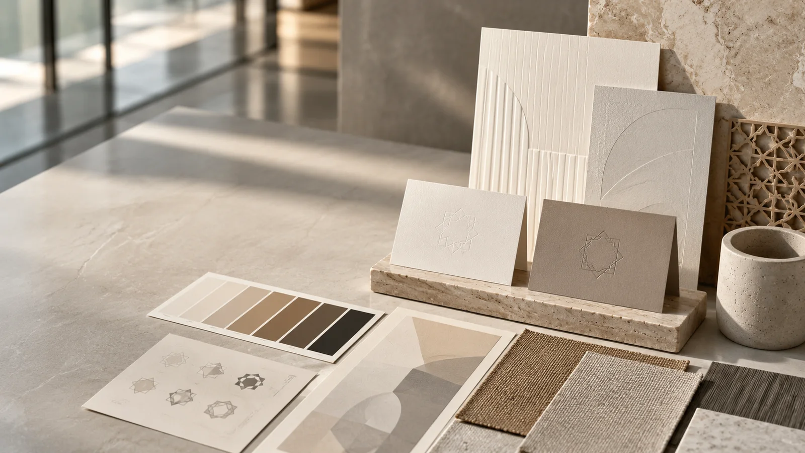
“Brand identity” arrives in a brief carrying three separate meanings, and the brief rarely says which one is intended. It can mean a logo, the full visual system, or the positioning and strategy that sits above the design. Settling which of the three is on the table is the first thing worth doing. A logo without a system drifts the moment a new vendor touches it. A system without strategy can be executed flawlessly in the wrong direction.
Brand identity has a specific meaning. This article defines it, breaks down its core elements, explains why it matters in the UAE market in particular, and covers the bilingual Arabic-English dimension that most generic definitions skip.
What is brand identity?
Brand identity is the set of visible and verbal assets a company designs on purpose to be recognizable: the logo, colors, typography, imagery, and voice that work together so people can identify and remember the business. It covers how a brand looks and sounds, the part a customer actually meets, while the deeper question of what the company stands for sits in strategy above it.
The distinction is worth making clearly. ISO 10668, the international standard for brand valuation, frames a brand as a marketing-related intangible asset including names, terms, signs, symbols, logos, and designs that create distinctive images in the minds of stakeholders. Brand identity is the tangible, expressible part of that system: the artifacts the design team builds to make those distinctive images consistent and repeatable.
It is not the same as strategy. Strategy sits upstream and decides what the brand stands for and who it is for. Identity is the design layer that translates strategy into something a customer can see across a proposal cover, a trade-stand banner, and a LinkedIn profile.
Brand identity vs brand vs brand image: what is the difference?
Brand identity is what the company designs and controls, brand image is how audiences actually perceive it, and the brand itself is the relationship between the two. Put plainly: the identity is the input a company can author, the image is the result it can only influence, and strategy upstream decides what the whole system is trying to say.
| Term | What it is | Who owns it |
|---|---|---|
| Brand strategy | What the brand stands for: purpose, positioning, audience, value proposition | Leadership |
| Brand identity | How the brand looks and sounds: logo, color, type, imagery, voice | The design team |
| Brand image | How the brand is actually perceived by the market | The market |
For B2B companies in the UAE, the gap between identity and image matters practically. A mainland firm, a free-zone entity, and an international entrant may all describe similar services in their decks. A coherent identity is one of the most cost-effective ways to make a younger company appear established when a procurement team is comparing options.
What are the core elements of a brand identity?
A brand identity is built from five repeatable elements: logo system, color palette, typography, imagery direction, and tone of voice. Together they form a documented kit that a non-designer can apply consistently across every touchpoint, from a pitch deck to a trade-stand banner to a social post.
Logo system. This means a primary lockup, secondary and stacked versions, a monochrome variant, and a reversed version for dark backgrounds. Clear-space and minimum-size rules travel with the logo so every vendor who touches it knows how much breathing room to leave and how small it can go before it collapses.
Color palette. Each color specified across Pantone, CMYK, RGB, and HEX. Without all four values, the corporate color drifts between a print run and a screen render. The one-line note that tells a vendor which value to use in which medium is what separates a working palette from a mood board.
Typography. A primary typeface for headings, a secondary typeface for body copy, and a named system fallback for when the licensed font is unavailable. Without the fallback, the deck reflows into Calibri. Line-spacing, weight variations, and minimum sizes complete the section.
Imagery, iconography, and graphic devices. A consistent photography and illustration direction unifies separately commissioned assets into one library. A secondary graphic device drawn from the logomark’s anatomy extends the brand into patterns, backgrounds, and section dividers without requiring the logo itself to appear everywhere.
Voice and tone. The verbal half of the identity. Three to five adjectives that describe how the brand sounds, writing rules that keep copy consistent across teams and suppliers, and approved boilerplate for common scenarios. Without a defined voice, the brand can look unified on screen and sound like different companies in a proposal and a tender response.
Why does brand identity matter for UAE companies?
In a crowded UAE market where mainland firms, free-zone entities, and international entrants compete for the same B2B attention, a coherent brand identity builds recognition, signals credibility to investors and procurement teams, and keeps every touchpoint consistent as a company scales across the Gulf.
Recognition works through repetition. A consistent visual system makes a company memorable across LinkedIn, a printed proposal, and a trade stand, because the same colors, typography, and logo structure appear every time. A brand that looks different on each channel asks the audience to do extra work, and a buyer comparing several suppliers will quietly read that inconsistency as a lack of rigor.
Trust is the other dimension, and it carries more weight here than in a home market. A recent market entrant has no prior reputation for a procurement team or institutional investor to lean on. There is no shared client, no years of visible track record to verify quickly. So the visual system itself becomes the credibility document: the company profile, the investor deck, and the first proposal are doing the job that references and reputation do elsewhere. This is specifically the identity layer doing concrete, visible work. A buyer is assessing whether a company looks run with the same discipline across its communications as across its operations, and the only evidence in front of them is the artifacts.
For companies tracking toward a DFM or ADX listing or preparing for institutional investment, that same discipline carries into the investor deck and the annual report, where a consistent identity signals an organization that governs its communications as carefully as its numbers.
At scale, a documented identity is what stops a brand fragmenting as teams, agencies, and vendors multiply. The Government of Abu Dhabi brand guidelines ensure a unified brand and visual identity across all Abu Dhabi Government activities, and the UAE Government Media Office publishes the Visual Identity Guidelines for UAE Federal Government Entities, a formal downloadable manual that sets a unified standard across federal bodies. When the UAE’s own governing institutions document identity this formally, it sets the baseline expectation: a documented brand system reads as standard practice rather than corporate indulgence.
A word on where budgets actually go. Across our Malaysia and Singapore work, the cost of designing a brand identity is rarely the expensive part. The rollout is: re-skinning the website, the deck library, the report templates, the signage, the social kit, and then teaching every team and vendor to apply the system without drifting. When an identity disappoints, the cause is almost never a weak logo; it is a strong design that was never rolled out properly, so the old materials and the new ones sit side by side for years. Plan and budget for the rollout from the start, and the design earns its keep.
How does bilingual Arabic and English brand identity work?
A bilingual identity treats Arabic and English as equal from the first sketch, rather than adding the Arabic as a translation once the English version is approved. The logo, typography, and layout grid are designed for both right-to-left and left-to-right scripts together, so both versions receive the same design attention across signage, investor decks, and digital.
Arabic reads right-to-left and runs to a different length from equivalent English copy. Line breaks, lockup proportions, and column widths have to be planned for both scripts from the start. A lockup that retrofits an Arabic subtitle under an existing English mark rarely reads at equal weight; the Arabic version ends up carrying less visual authority than the English one.
Typeface pairing is its own discipline. Arabic and Latin typefaces sit at different default optical proportions, and a pairing that looks balanced at a glance often reads at unequal visual weight once set in running text. Choosing an Arabic face whose optical size matches the Latin face at the same point size is the work; relying on whatever ships bundled with the design tool rarely produces a result where neither script visually dominates the other.
For the Arabic version of a logo lockup, the mark has to be drawn from scratch. A fluent calligrapher or type designer produces the Arabic wordmark, not a translator, so it has the same visual integrity as its English counterpart.
To make those principles concrete, take a single artifact a UAE company produces early and often: the cover of a bilingual investor deck or company profile. Walking the decisions in sequence shows where the work actually sits. The cover starts as the English template, with the combination mark resting top-left and the title block running beneath it. The Arabic version is not that template flipped. The grid is redrawn so the eye enters from the right, which moves the mark to the top-right and reverses the title block to align right. The drawn Arabic wordmark is placed against the title, and its weight is chosen to match the optical density of the Latin mark at that size, not its nominal point size, because an Arabic face set at the same points usually reads heavier. The line break in the Arabic title is decided by where the phrase divides naturally, which is rarely the same place the English line breaks, so the two covers carry a different number of lines and the vertical spacing is tuned for each. A native Arabic reader then reviews the proof, and the catch is almost never a spelling error; it is tone, a word that is grammatically correct but reads stiff, or a line break that splits a phrase awkwardly. That single cover, done properly, sets the pattern every later spread follows.
Our team has produced bilingual identities in Bahasa Malaysia and English since 2018. The same structural thinking carries to Arabic and English: plan the grid, the lockup proportions, and the typographic weight pairings before any single-language version is finalized.
Common brand identity mistakes UAE companies make
The recurring failures in UAE identity work cluster around one root cause: building for English first and treating everything else as a later patch. None is fatal on its own, but each is far cheaper to avoid than to unwind once the brand is in market.
Building English-first and inventing the Arabic layout on the fly. A system designed only for left-to-right reading forces whoever needs the Arabic version next to improvise it. The grid, the alignment, and the lockup placement get guessed at under deadline, and the Arabic asset ends up presenting as a different brand because, in proportion and reading direction, it effectively is one. The fix is to draw the bilingual grid into the system from the start, well ahead of any spread-by-spread retrofit.
Treating the Arabic lockup as a translation instead of commissioning a drawn mark. Running the English name through a translator and setting it in the first available Arabic font produces a wordmark that is linguistically correct and visually wrong. The Arabic mark needs to be drawn or carefully typeset by someone fluent in the script, with the weight, line break, and placement chosen as design decisions. A translated lockup almost always reads at a different visual weight from its English counterpart.
Stretching one identity unmanaged across free-zone and mainland entities. A group with a free-zone branch and a mainland company often ships the “same brand” under two slightly different legal names, with no documented rule for how the mark, the name, and the lockup behave for each entity. The result is a logo that appears in inconsistent forms across trade licenses, signage, and listings, so the group reads as several loosely related companies rather than one. A short entity-application rule in the brand book, naming which version of the mark and name each legal entity uses, prevents most of this.
Shipping the design with no rollout plan. The identity is approved, the website is reskinned, and then the deck library, the report templates, the email signatures, and the exhibition graphics keep circulating in the old brand for months. For a multi-entity group this is the costliest error, because the inconsistency compounds across every entity at once. Budget and schedule the rollout as its own phase, with an owner, rather than assuming it happens on its own after launch.
How do brand identity and search visibility connect?
A consistent brand identity is also a consistent entity signal, and that signal is what search engines and AI answer engines use to attribute information to the right company. The risk specific to the UAE is naming: an organization spelled or rendered inconsistently in Arabic and English, or listed differently across its free-zone and mainland entities, fragments that signal and confuses both human readers and machines about who it actually is.
The problem is concrete. A company might appear as one English spelling on its website, a slightly different transliteration on a directory, an Arabic name on its trade license collateral, and a separate legal name for its free-zone branch. To a person, these are obviously the same business. To a search engine building its understanding of an entity, they can register as several separate businesses, which dilutes the recognition any single listing earns.
Google’s guidance on Organization structured data points at the consistency that helps. It notes that adding the logo property “can help Google better understand which logo you want to show, for example in Search results and knowledge panels,” and it provides properties for the organization’s name, its legal name where that differs, and its URL. The practical reading for a UAE company is that the name, legal name, and logo it presents should be governed the same way across Arabic and English and across every legal entity, so the machine attributes everything to one organization rather than scattering it.
This is where the brand book does double duty. The same naming and lockup rules that keep the brand looking consistent to a buyer also keep it recognizable as a single entity to a search engine. Decide the canonical English spelling, the canonical Arabic rendering, the legal name for each entity, and which logo is the primary one, document them, and apply them everywhere. The identity discipline and the entity signal are the same work, captured once.
What does a strong brand identity look like? Examples and patterns
Strong B2B brand identities share a small number of structural traits that hold regardless of category. The patterns below are drawn from the type of identity work in our portfolio, described as design principles rather than client-specific outcome claims, so they can be assessed against any system.
A combination mark designed to scale. A logo that works at 32 pixels as a favicon and at 3 meters on a building sign is not two logos; it is one mark built with that range in mind from the first sketch. Most marks that collapse at small sizes were drawn at A4 and never tested below it.
A secondary graphic device derived from the logomark’s geometry. Taking a shape or motif from the primary mark and extending it into patterns, dividers, and backgrounds gives the brand presence without overusing the logo. The device makes a deck feel on-brand even on slides where the logo sits only in a corner.
Color and form chosen for a multicultural, multilingual audience. In the UAE, a palette that reads cleanly across Arabic, English, and South Asian audiences, and across both luxury and technical registers, is a more durable asset than one designed for a single cultural lens.
How do brand identity, logo design, and a brand book fit together?
The logo is one element of the identity. The full identity is the logo plus color, type, imagery, and voice. The brand book is the document that records all of it so non-designers can apply the brand correctly without phoning the designer.
The sequence matters. Strategy names the positioning and value proposition. Identity is designed against that strategy. The brand book documents the result with enough specificity that a printer in one country and a social media manager in another are working from the same rules.
A logo alone cannot do this. A single mark without color specifications, typeface rules, and clear-space guidance drifts the moment a third party touches it. Vendors guess at the color; the deck uses a different weight of the same typeface; the Arabic lockup shrinks to a caption-sized subtitle. Each compromise is small; the accumulated effect is a brand that reads inconsistently across every touchpoint.
A workable UAE brand book documents, at minimum:
- Logo system: primary, secondary, stacked, monochrome, and reversed versions, with clear-space and minimum-size rules.
- Color: each color across Pantone, CMYK, RGB, and HEX, with a note on which value to use in which medium.
- Typography: primary and secondary typefaces, a named system fallback, and hierarchy and spacing rules.
- Imagery and graphic device: photography and illustration direction, plus the secondary device and how it is applied.
- Voice and tone: the adjectives, the writing rules, and approved boilerplate.
- Application templates: company profile, investor deck, proposal, social, and signage masters.
- Governance: the role that approves exceptions, so the document stays current as the brand is used.
Two rows are specific to a bilingual UAE system and would not appear in a single-language brand book. The first is the bilingual rules section: which version of the logo is used in Arabic versus English contexts, how the Arabic and English lockups are built, and which Arabic type pairing is approved against the Latin face. The second is the vendor brief, with the native-Arabic-review step written into it rather than assumed, so a supplier who has never read the strategy still produces Arabic that holds the brand voice. Both rows carry their own decisions and templates, which is why a bilingual brand book runs longer than its single-language equivalent and deserves a dedicated section rather than a footnote.
For the wider question of what branding is and how strategy feeds into identity work, the what branding is for a B2B company post in this cluster provides the upstream context this definition article sits under.
How Walk Production can help
Walk Production is an integrated creative agency that builds brand identities, from logo and color systems to typography, applications, and bilingual brand books. Our track record is in Malaysia and Singapore; we now serve the UAE market. One in-house team handles strategy, design, and copywriting.
The offering covers brand strategy, logo design, corporate identity, brand guidelines, brand audit, and brand activation, engaged individually or as a full identity transformation. The bilingual planning discipline our team applies to Bahasa Malaysia and English carries structurally to Arabic and English.
If you are a UAE company looking to build or rebuild your identity system, explore our branding service and logo design, browse the portfolio, including our corporate rebrand for Magma Group Berhad, a group spanning hospitality and property, from our branding work in Malaysia and Singapore, or get in touch to talk through the brief.
Video transcript
Many founders ask for a brand identity when they really mean a logo. A logo is one piece; identity is the whole system. Here is what that means, and why it holds. Brand identity is everything designed to be recognized: logo, colors, typography, imagery, and voice. The part a customer actually meets. Strategy above decides what you stand for.
The identity is built from 5 elements. Logo, color, typography, imagery, and voice. Each color in Pantone, CMYK, RGB and HEX, or it drifts. Voice is 3-5 adjectives with holding rules. Why here? Mainland, free-zone and international entrants chase the same buyers. A recent entrant has no track record to verify. A coherent identity makes a young firm read as established, the credibility document, up to a DFM or ADX listing.
Arabic and English are designed together from the first sketch. Arabic reads right to left, at a different length. The wordmark is drawn by a calligrapher, not translated. Retrofit it, and it reads as the junior partner. 4 mistakes recur. Building English first; treating the Arabic lockup as a translation; stretching one brand across free-zone and mainland, no rule; and shipping with no rollout plan, the costliest.
A consistent identity is a consistent entity signal. Different spellings across site, directories and licenses let a search engine read one company as several. Set one canonical name and logo, applied everywhere. Strong identities share a few traits. One mark that works at 32 px and at 3 m. A secondary device drawn from the logomark. A palette reading across Arabic, English and South Asian audiences.
It all lives in a brand book, so anyone stays on-brand. Logo, color, type, imagery, voice, templates, governance. A bilingual book adds 2 rows single-language ones skip: lockup rules, and a vendor brief with native Arabic review. Walk Production is an integrated creative agency. One in-house team does strategy, design, copywriting. We have built bilingual identities since 2018, including a rebrand for a hospitality and property group.
So brand identity is the system, not the logo: designed on purpose, documented, bilingual from the start. Get it right, and a young company reads built to last. Plan yours with Walk Production.